Creating Tabs with HTML, CSS & jQuery
In this tutorial, we’re going look at how to create tabs in HTML, CSS and jQuery. If you get stuck, don’t hesitate to ask me a question.
Tabs are a great way of grouping lots of content into a very small space. Think of tabs like the TARDIS…bigger on the inside. They can be incredibly handy when you have a lot of content that would simply fill up your page with too much information in one go.
You might also like: Creating an Accordion with HTML, CSS & jQuery.
Table of Contents
- Skip to the HTML
- Skip to the CSS
- Skip to the jQuery
1 The HTML
Completed Code (HTML)
I go into detail on the specifics of the HTML layout below.
<div class="tabs">
<ul class="tab-links">
<li class="active"><a href="#tab1">Tab #1</a></li>
<li><a href="#tab2">Tab #2</a></li>
<li><a href="#tab3">Tab #3</a></li>
<li><a href="#tab4">Tab #4</a></li>
</ul>
<div class="tab-content">
<div id="tab1" class="tab active">
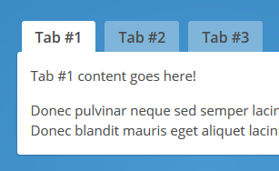
<p>Tab #1 content goes here!</p>
<p>Donec pulvinar neque sed semper lacinia. Curabitur lacinia ullamcorper nibh; quis imperdiet velit eleifend ac. Donec blandit mauris eget aliquet lacinia! Donec pulvinar massa interdum risus ornare mollis.</p>
</div>
<div id="tab2" class="tab">
<p>Tab #2 content goes here!</p>
<p>Donec pulvinar neque sed semper lacinia. Curabitur lacinia ullamcorper nibh; quis imperdiet velit eleifend ac. Donec blandit mauris eget aliquet lacinia! Donec pulvinar massa interdum risus ornare mollis. In hac habitasse platea dictumst. Ut euismod tempus hendrerit. Morbi ut adipiscing nisi. Etiam rutrum sodales gravida! Aliquam tellus orci, iaculis vel.</p>
</div>
<div id="tab3" class="tab">
<p>Tab #3 content goes here!</p>
<p>Donec pulvinar neque sed semper lacinia. Curabitur lacinia ullamcorper nibh; quis imperdiet velit eleifend ac. Donec blandit mauris eget aliquet lacinia! Donec pulvinar massa interdum ri.</p>
</div>
<div id="tab4" class="tab">
<p>Tab #4 content goes here!</p>
<p>Donec pulvinar neque sed semper lacinia. Curabitur lacinia ullamcorper nibh; quis imperdiet velit eleifend ac. Donec blandit mauris eget aliquet lacinia! Donec pulvinar massa interdum risus ornare mollis. In hac habitasse platea dictumst. Ut euismod tempus hendrerit. Morbi ut adipiscing nisi. Etiam rutrum sodales gravida! Aliquam tellus orci, iaculis vel.</p>
</div>
</div>
</div>
Tab Links
Starting off there’s a div with class="tabs". Inside there’s an un-ordered list, (or an ordered one if you like, it makes no difference to this tutorial), with class="tab-links". Inside the list items there are anchor links. The first list item is marked as class="active". This indicates where to start the tabs.
Note: When the CSS is all done, the tab link parent with class="active" will be the highlighted one on page load.
<div class="tabs">
    <ul class="tab-links">
        <li class="active"><a href="#tab1">Tab #1</a></li>
        <li><a href="#tab2">Tab #2</a></li>
        <li><a href="#tab3">Tab #3</a></li>
        <li><a href="#tab4">Tab #4</a></li>
    </ul>
</div>
Tab Content
There’s a div with class="tab-content". Inside that we have 4 divs, each with class="tab", (this number corresponds to how many tab links there are). The currently visible tab will also need an active class, e.g. class="tab active".
<div class="tab-content">
    <div id="tab1" class="tab active">
        <p>Tab #1 content goes here!</p>
        <p>Donec pulvinar neque sed semper lacinia. Curabitur lacinia ullamcorper nibh; quis imperdiet velit eleifend ac. Donec blandit mauris eget aliquet lacinia! Donec pulvinar massa         interdum risus ornare mollis.</p>
    </div>

    <div id="tab2" class="tab">
        <p>Tab #2 content goes here!</p>
        <p>Donec pulvinar neque sed semper lacinia. Curabitur lacinia ullamcorper nibh; quis imperdiet velit eleifend ac. Donec blandit mauris eget aliquet lacinia! Donec pulvinar massa interdum risus ornare mollis. In hac habitasse platea dictumst. Ut euismod tempus hendrerit. Morbi ut adipiscing nisi. Etiam rutrum sodales gravida! Aliquam tellus orci, iaculis vel.</p>
    </div>

    <div id="tab3" class="tab">
        <p>Tab #3 content goes here!</p>
        <p>Donec pulvinar neque sed semper lacinia. Curabitur lacinia ullamcorper nibh; quis imperdiet velit eleifend ac. Donec blandit mauris eget aliquet lacinia! Donec pulvinar massa interdum ri.</p>
    </div>

    <div id="tab4" class="tab">
        <p>Tab #4 content goes here!</p>
        <p>Donec pulvinar neque sed semper lacinia. Curabitur lacinia ullamcorper nibh; quis imperdiet velit eleifend ac. Donec blandit mauris eget aliquet lacinia! Donec pulvinar massa interdum risus ornare mollis. In hac habitasse platea dictumst. Ut euismod tempus hendrerit. Morbi ut adipiscing nisi. Etiam rutrum sodales gravida! Aliquam tellus orci, iaculis vel.</p>
    </div>
</div>
2 The CSS
I’m going to keep it simple with basic CSS (as opposed to an SCSS pre-processor like Sass, Less or Stylus). The bulk of this tutorial is aimed at beginners, so I’m taking that into account.
Completed Code (CSS)
I go into detail on the specifics of the CSS styling below.
/*----- Tabs -----*/
.tabs {
    width:100%;
    display:inline-block;
}

    /*----- Tab Links -----*/
    /* Clearfix */
    .tab-links:after {
        display:block;
        clear:both;
        content:'';
    }

    .tab-links li {
        margin:0px 5px;
        float:left;
        list-style:none;
    }

        .tab-links a {
            padding:9px 15px;
            display:inline-block;
            border-radius:3px 3px 0px 0px;
            background:#7FB5DA;
            font-size:16px;
            font-weight:600;
            color:#4c4c4c;
            transition:all linear 0.15s;
        }

        .tab-links a:hover {
            background:#a7cce5;
            text-decoration:none;
        }

    li.active a, li.active a:hover {
        background:#fff;
        color:#4c4c4c;
    }

    /*----- Content of Tabs -----*/
    .tab-content {
        padding:15px;
        border-radius:3px;
        box-shadow:-1px 1px 1px rgba(0,0,0,0.15);
        background:#fff;
    }

        .tab {
            display:none;
        }

        .tab.active {
            display:block;
        }
Tabs Container
The display:inline-block; part adds a type of clearfix while also making it more ‘stable’ than if we used display:block;.
The reason we use a clearfix above yet not here is as follows: display:inline-block; sometimes adds 7px-ish of margin below the affected element with no way of removing it. Sometimes using a minus bottom margin works, but it depends heavily how your HTML is structured. In this instance it’s fine.
/*----- Tabs -----*/
.tabs {
    width:100%;
    display:inline-block;
}
Tab Link Wrappers
We declare no list-style to stop it appearing as a default list. Then the margin so the links are spaced evenly apart, (using margin:0px 5px; is the same as using margin:0px 5px 0px 5px;).
.tab-links li {
    margin:0px 5px;
    float:left;
    list-style:none;
}
Tab Links
These are all basic styles which you should understand if you’re attempting this tutorial. If you don’t, please find the proper values and the definitions for each on the CSS-Tricks Almanac.
You may be wondering why I’ve used transition:all linear 0.15s; instead of transition:background linear 0.15s;. The reason is simple, in my experience you have to think ahead. If you don’t then nasty, (sometimes hard to fix), bugs pop-up seemingly out of nowhere. By using background instead of all, we’d be limiting what can be transitioned on the :hover effect. Since this is a tutorial, many of you may want to change the text color on hover. By using all instead of background that makes it possible.
    .tab-links a {
        padding:9px 15px;
        display:inline-block;
        border-radius:3px 3px 0px 0px;
        background:#7FB5DA;
        font-size:16px;
        font-weight:600;
        color:#4c4c4c;
        transition:all linear 0.15s;
    }

    .tab-links a:hover {
        background:#a7cce5;
        text-decoration:none;
    }

li.active a, li.active a:hover {
    background:#fff;
    color:#4c4c4c;
}
Tab Content
This is the background of the tab content section.
/*----- Content of Tabs -----*/
.tab-content {
    padding:15px;
    border-radius:3px;
    box-shadow:-1px 1px 1px rgba(0,0,0,0.15);
    background:#fff;
}
Non-Active/Active Tab Content
We set all tabs to display:none; which hides them. Then we set the active tab to display:block; so ONLY that one will show up. It’s a simple case of using CSS the way it was designed, which was to cascade down. Hence the name, Cascading Stylesheets.
.tab {
    display:none;
}

.tab.active {
    display:block;
}
You might also like: Creating a Dropdown Menu with HTML & CSS
3 The jQuery
Below you can see the completed jQuery code. Keep scrolling for a good explanation of how it all works and what it all means.
Let me clarify something before we start: Everyone has their own way of coding, with jQuery this is mine. Writing it out like this makes it easier for a beginner to grasp, it’s also efficient.
Completed Code (jQuery)
jQuery(document).ready(function() {
    jQuery('.tabs .tab-links a').on('click', function(e)  {
        var currentAttrValue = jQuery(this).attr('href');

        // Show/Hide Tabs
        jQuery('.tabs ' + currentAttrValue).show().siblings().hide();

        // Change/remove current tab to active
        jQuery(this).parent('li').addClass('active').siblings().removeClass('active');

        e.preventDefault();
    });
});
Basic Setup
You have to start by checking if the document is ready, for this we use:
jQuery(document).ready(function() {
    // Code Here
});
Next is to check if the user has clicked on a tab, to do that we simply reference every link that happens to be a tab link with .tab-links a.
jQuery('.tab-links a').on('click', function(e)  {
    // More Code Here
});
Dynamic Variable
Next we create a variable called currentAttrValue, (current attribute value), which grabs the href="" of the clicked anchor link.
var currentAttrValue = jQuery(this).attr('href');
Match Anchor Link to Div #ID
We need a way of matching up the .tab-link achors with .tab sections. We start off by referring to the entire tabs component, with .tabs, then we say “If .tabs has a child with an #id that then matches a .tab-link href="", then they should be linked up”.
Then we say “Show the element with the referenced #id, such as #tab2, then find the other tabs, which are siblings of #tab2, and hide them”.
jQuery('.tabs ' + currentAttrValue).show().siblings().hide();
Giving The Tab Link an Active State
Changing the active state of the tab link is relatively the same as showing/hiding the tab content.
First we look for jQuery(this), which is the current anchor link being clicked. Then we find it’s parent list item with .parent('li') tag. After that we give that parent list item a class of .active by using .addClass('active'). Lastly we find all siblings of that parent list item and remove, if any, classes of .active by using .siblings().removeClass('active').
jQuery(this).parent('li').addClass('active').siblings().removeClass('active');
Prevent Default Anchor Link Behaviour
You may notice that when you click an anchor link with an #id specified instead of an actual URL, it tends to add the #id into the address bar. E.G. http://sebkay.com becomes http://sebkay.com#id. This can be a massive pain-point for users when trying to click the back button.
To get past that UX problem we use:
e.preventDefault();
This handy little function stops the default action of the clicked element from happening.
Remember when we put that function(e) in the start of our click event? Well this is where that ties in.
Extra Credit: jQuery Animations
You may not like the way it just jumps to the new tab content without any nice animation of any kind, well here’s some extra credit.
To apply these changes simply replace the below snippet with the other code snippets that follow.
Default
// Show/Hide Tabs
jQuery('.tabs ' + currentAttrValue).show().siblings().hide();
Fade
// Show/Hide Tabs
jQuery('.tabs ' + currentAttrValue).fadeIn(400).siblings().hide();
Slide 1
// Show/Hide Tabs
jQuery('.tabs ' + currentAttrValue).siblings().slideUp(400);
jQuery('.tabs ' + currentAttrValue).delay(400).slideDown(400);
Slide 2
// Show/Hide Tabs
jQuery('.tabs ' + currentAttrValue).slideDown(400).siblings().slideUp(400);
Conclusion
If you’re reading this conclusion, (most people, including me, tend to leave after they’ve got the code they were after), then please leave a comment below with any problems or bugs regarding this tutorial. I’m writing this to help people learn and become the best they can be.
You might also like: 21 Must Have Front End Development Tools