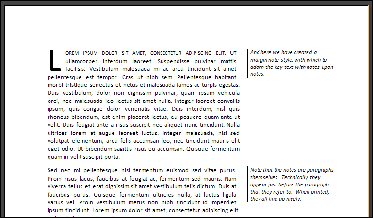
In this post of per-paragraph commenting app tutorial series, we will create a layout of how annotations will look like when they are rolled out and visible. Here, we first develop the mobile screen view and then the regular screen views using mobile-first design principles.
In the previous post, we fiddled with CSS3 shapes to create speech bubbles and decided to keep rectangular speech bubbles rather than oval speech bubbles. Now, we use the same markup and extend it further. You can start to tinker here.
See the Pen Annotations Tutorial: Making annotation bubbles by Anshul Thakur (@anshulthakur) on CodePen.
So far, we have a layout and signifier sign-posts to show that there are annotations in the form of speech bubbles. Now, we'd like to see how annotations would look like when visible. Here comes a fork: on a large screen, where we have enough estate to show annotations alongside the content, we would like it to appear there. But, this is not going to work for mobile screens. Why? Because if we stuff in both of them in a single row, each of them would either be clipped, or appear smaller than we want. We don't want the user to swipe left right to make annotations, but continue with their flow of downward scroll.
Also, we noticed problems with hovering in the previous post of this tutorial. We'd want to rid our layout of that too. Here is how I propose to do it initially. We wrap each content block and its respective annotations with a div identified by the class name annotation--container , and let its direct descendants float to the left. On small screens, this will cause them to stack on top of each other (or better, we will add a media query to make them relatively positioned block elements).
Let's try it. The markup is transformed to:
<div data-section="1" class="annotation--container clearfix">
<p id="1">So, here is how we answered them:</p>
<div class="comments clearfix">
<h3 class="comments--toggle rectangular-speech has-annotations"><p>15</p></h3>
<div class="comments-container">
<span class="comments-container--text">Lorem Ipsum </span>
<span class="comments-container--text">Your documentation source should be written as regular Markdown files,
and placed in a directory somewhere in your project.
Normally this directory will be named docs and will exist at the top level of your project,
alongside the mkdocs.yml configuration file. </span>
</div>
</div>
</div>
We've wrapped our content blocks (<p> </p> in our case) within <div> elements with class name as " annotation--container ". The naming scheme is pretty messed up currently, don't worry, we'll sort it out as we go and restore order in our markup. For starters, we are dabbling with the B.E.M. scheme. For javascript's sake, we'll add a data-section attribute. To ensure that the blocks side up on large screens and stack on smaller ones, we've used the media query as follows:
.annotation--container{
position: relative;
width: 100%;
&>*{
position: relative;
display: block;
@media(min-width: $screen-md){
overflow: visible;
}
}
For large screens, we would want the speech bubble on the top left corner of our annotations, while for mobile screens, somewhere at the right top:
.comments--toggle{
display:none;
position: absolute;
right: 0px;
top: -50%;
@media(min-width: $screen-md){
top: 0;
left: 0;
right: auto;
}
Okay, by default, only the annotations symbol must be visible, and that doesn't require too much space. Rest of the annotation block will become visible only if someone clicks on that annotation button. This will become more evident in the next tutorial when we actually add that interactivity to the page. Currently, we just want to see how it will look on smaller and larger screens when the annotations have been rolled out.
So, we add the following stylesheets:
.comments-container{
padding: 0;
padding-left: 10%;
position: relative;
/* On larger screens, their widths are smaller, constrained*/
@media(min-width: $screen-md){
width: 30rem;
padding: 20px 0 0 40px;
}
color: lighten($text-color, 40%);
}
This means that on a larger screen, the annotations will be constrained to a 30rem width (on the right side of the text), while for small screens, where they appear under the paragraph, they'll take up the complete width of the container except for the left sided space of 10% (to distinguish them from regular content).
Here, we also need to consider the resolutions in between the large and the small. For medium sized desktop screens, if the above settings are in place, then there would be a horizontal scroll and a lot of empty space on the left side of the article block. Now that wouldn't be nice, would it? So, we would like the content to shift leftwards to make space for annotations when user wants to make annotations by clicking on the annotations button. We presume that the user doesn't want to read and make annotations simultaneously. So, we add the following to our overall annotations-container:
@media(min-width: $screen-md) and (max-width: $screen-lg){
transform: translate(-25rem,0);
transition: all 1s;
}
In the last leg of this iteration, lets look at the annotations too. They are indistinguishable from regular content. And because they are spans, they aren't stacking. So, let us correct that.
.comments-container--text{
display: block;
position: relative;
padding-top: 20px;
font-size: 1.2rem;
&:first-child{
padding-top: 5px;
}
}
Except for the first annotation, we would like each annotation to leave a top padding of 20px , to separate it from its previous annotation. We could have added a bottom margin instead too, and not cared to add the :first-child selector, but then, chances are, we would have needed the :last-child selector to remove the margin from the last element.
How does it look now? I think it looks fine. However, new problems have cropped up. First, the ones with annotations unhidden do not show the hover effects. Second, some annotation symbols still don't persist on hovering around.
We can try altering the z-index of annotations box, but that will cause more pain by making the little squiggles appear above the annotation box. The problem is because we didn't read quite properly how z-indexes are supposed to behave. Here’s an excerpt from Philip Watson's blog:
New stacking contexts can be formed on an element in one of three ways:
* When an element is the root element of a document (the <html> element)
* When an element has a position value other than static and a z-index value other than auto
* When an element has an opacity value less than 1
Long story short, stacking context is akin to co-ordinate systems, but instead of telling where the object is going to lie in 2D space, it determines their relative positioning in the third dimension (the one with planes projecting out of the screen towards the user). Where were we guilty? The third clause, the gradient property makes the objects have varying opacity, and was the culprit. So, if you can do with no gradients (I know I can), then just removing the gradients will solve the problem. Now they change colors.
The other one is more or less liveable with, for now. Let us tackle it in our next section where we add interactivity to them along with responsiveness. Meanwhile, the completed pen is shown below.
See the Pen Annotations (Rolled out state) by Anshul Thakur (@anshulthakur) on CodePen.