Follow:
How to Create CSS3 Speech Bubbles Without Images
Craig explains pictorially how CSS Borders behave and how to create trianglular CSS shapes using pseudo-selectors without writing even a single line of Javascript or Jquery.
I didn't understand one bit of how designers made those tiny triangles and CSS shapes. Then, I found this little article, and every time I am stuck, I am able to recreate the entire lesson from scratch and achieve my ends. It is a short read, and the major meat of the lesson is contained in 20 something lines. It was a read-once-never-forget article for me.
I remember my creating my first image-less speech bubble many years ago. It required a long-winded JavaScript function to inject elements into the DOM, some horrendous CSS, looked fairly awful, and didn’t work well in IE5.
CSS3 is starting to change our lives for the better. It’s now possible to create a great looking speech bubble which works in all browsers, uses a single HTML element, a few lines of CSS3 code, no images, and no JavaScript whatsoever…
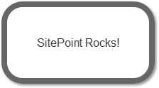
To ease you in gently, let’s examine the HTML. A single element is required, so I’m using a P tag:
<p class="speech">SitePoint Rocks!</p>First, we’ll style the outer box:
p.speech {
  position: relative;
  width: 200px;
  height: 100px;
  text-align: center;
  line-height: 100px;
  background-color: #fff;
  border: 8px solid #666;
  -webkit-border-radius: 30px;
  -moz-border-radius: 30px;
  border-radius: 30px;
  -webkit-box-shadow: 2px 2px 4px #888;
  -moz-box-shadow: 2px 2px 4px #888;
  box-shadow: 2px 2px 4px #888;
}
Nothing too complicated there. The only essential property is position: relative which is necessary for the speech bubble pointer. We also require Mozilla and Webkit vendor prefixes for border-radius and box-shadow to ensure they work in all CSS3 browsers. IE8 and below will show squared corners and no shadow, but the box will still be visible.
Now we need to create the triangular bubble pointer. Rather than resorting to images, we can use CSS borders to create any type of triangle. As a brief explanation, examine an element with wide differently-colored borders:

If we reduce the width and height of our element to 0px and use different sized borders, we can see different triangles being formed:

For our speech bubble pointer, we can therefore use a solid top and left border with transparent right and bottom borders:

But what do we assign those border properties to? Fortunately, we can use the CSS :before and :after pseudo-elements to generate two more content items. Therefore:
p.speech:before {
content: ' ';
position: absolute;
width: 0;
height: 0;
left: 30px;
top: 100px;
border: 25px solid;
border-color: #666 transparent transparent #666;
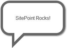
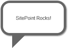
}The triangle is positioned at the bottom of our bubble. Incidentally, don’t bother trying to apply a shadow to this element — it’ll be shown around the transparent borders rather than the visible triangle.
We must now remove a section of this triangle. We can position a smaller white triangle over the gray one to achieve that effect:
p.speech:after {
  content: ' ';
  position: absolute;
  width: 0;
  height: 0;
  left: 38px;
  top: 100px;
  border: 15px solid;
  border-color: #fff transparent transparent #fff;
}
Our pure CSS3 image-less speech bubble is complete.
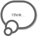
In essence, we can utilize the :before and :after pseudo-elements to create many different effects. For example, a thought bubble can be created with two content items rounded into circles:
p.thought {
  position: relative;
  width: 130px;
  height: 100px;
  text-align: center;
  line-height: 100px;
  background-color: #fff;
  border: 8px solid #666;
  -webkit-border-radius: 58px;
  -moz-border-radius: 58px;
  border-radius: 58px;
  -webkit-box-shadow: 2px 2px 4px #888;
  -moz-box-shadow: 2px 2px 4px #888;
  box-shadow: 2px 2px 4px #888;
}

p.thought:before, p.thought:after {
  left: 10px;
  top: 70px;
  width: 40px;
  height: 40px;
  background-color: #fff;
  border: 8px solid #666;
  -webkit-border-radius: 28px;
  -moz-border-radius: 28px;
  border-radius: 28px;
}

p.thought:after {
  width: 20px;
  height: 20px;
  left: 5px;
  top: 100px;
  -webkit-border-radius: 18px;
  -moz-border-radius: 18px;
  border-radius: 18px;
}
Please see the demonstration page for an example which uses these techniques. All the CSS code is contained in the HTML source.
More from this author
Have you used similar techniques to create other effects?
If you enjoyed reading this post, you’ll love Learnable; the place to learn fresh skills and techniques from the masters. Members get instant access to all of SitePoint’s ebooks and interactive online courses, like Learn CSS3.
Comments on this article are closed. Have a question about CSS3? Why not ask it on our forums?